
PROJECTS / LESS & CO
Brand Identity · Packaging · Shopify Website
Less & Co is a clothing brand built around a simple idea: less noise, better choices.
I created the visual identity and carried it across everything from the clothes
themselves to the box they arrive in - and eventually, the website they live on.
LESS & CO
GET TO KNOW THE BRAND
Less & Co is rooted in understated, everyday clothing - pieces
designed around good fabric, thoughtful fits and longevity rather
than trends. The identity needed to feel just as considered: minimal,
but not anonymous. Premium, but not precious. Quiet, with enough
character to be remembered.


LOGO
The final mark brings the L and C together in one continuous gesture,
a compact signature that feels simple at first glance, but has a little
more personality when you look closer. That balance became the
foundation for the rest of the brand: restrained, recognisable and
never trying too hard.
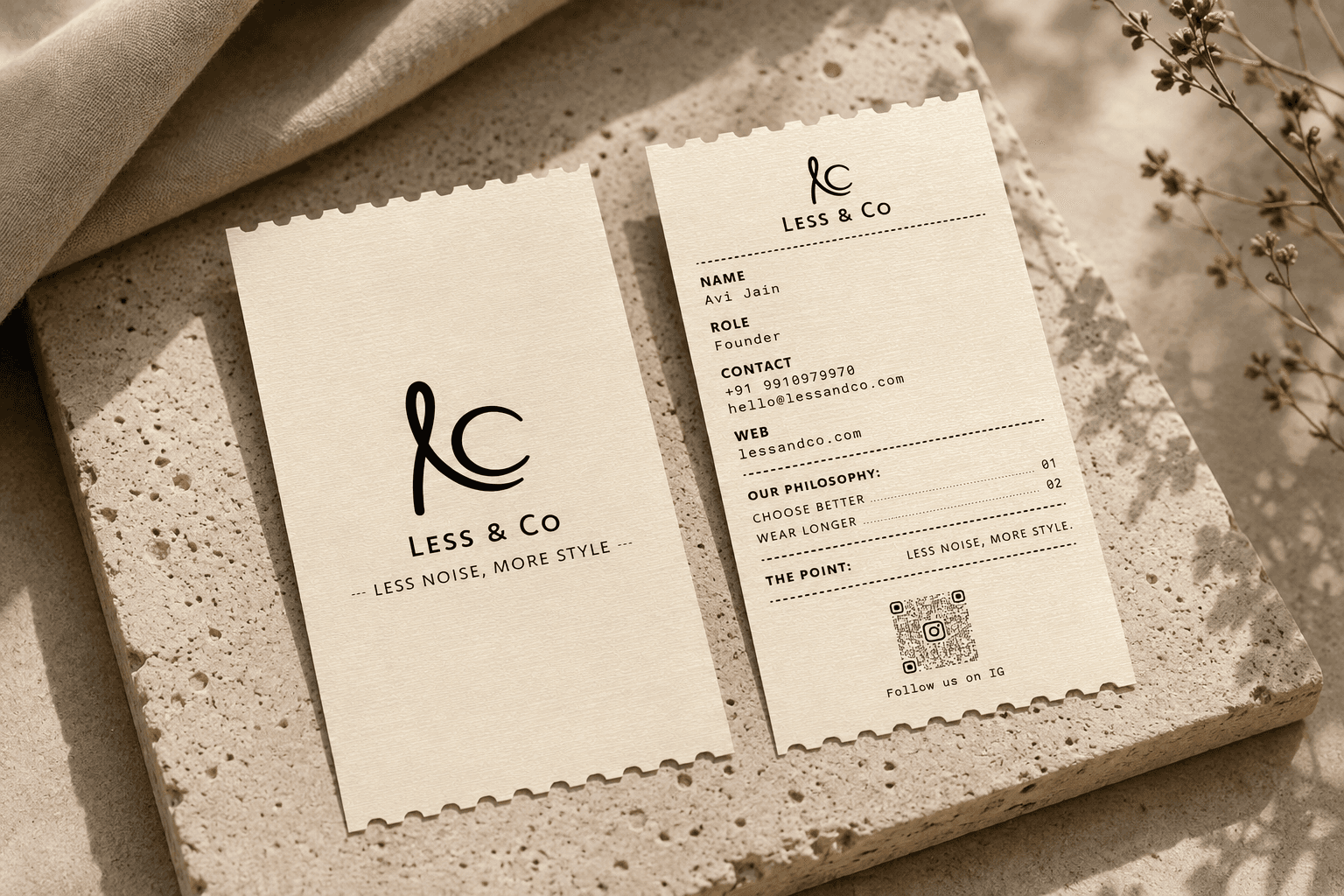
NOT YOUR USUAL BUSINESS CARD
Rather than turning the visiting card into another polished little rectangle,
I treated it more like a receipt - functional, familiar and slightly unexpected.
Brand details, contact information and QR code are organised like line
items, giving a minimal identity a more playful physical touchpoint.
THE DETAILS
The tags were designed as small extensions of the Less & Co.
identity - each with a different job to do, but all speaking the same visual
language.From the hangtag that introduces the brand, to the labels and
size markers that become part of the garment itself, every detail was kept
simple, tactile and intentional.
FROM RAIL TO DOORSTEP
The packaging was designed as another extension of the same system -
understated on the outside, considered in the details.The goal wasn't
to make the unboxing unnecessarily elaborate. It was to make receiving
something from Less & Co. feel like receiving Less & Co.
Brand Mark


Wordmark
Lockup


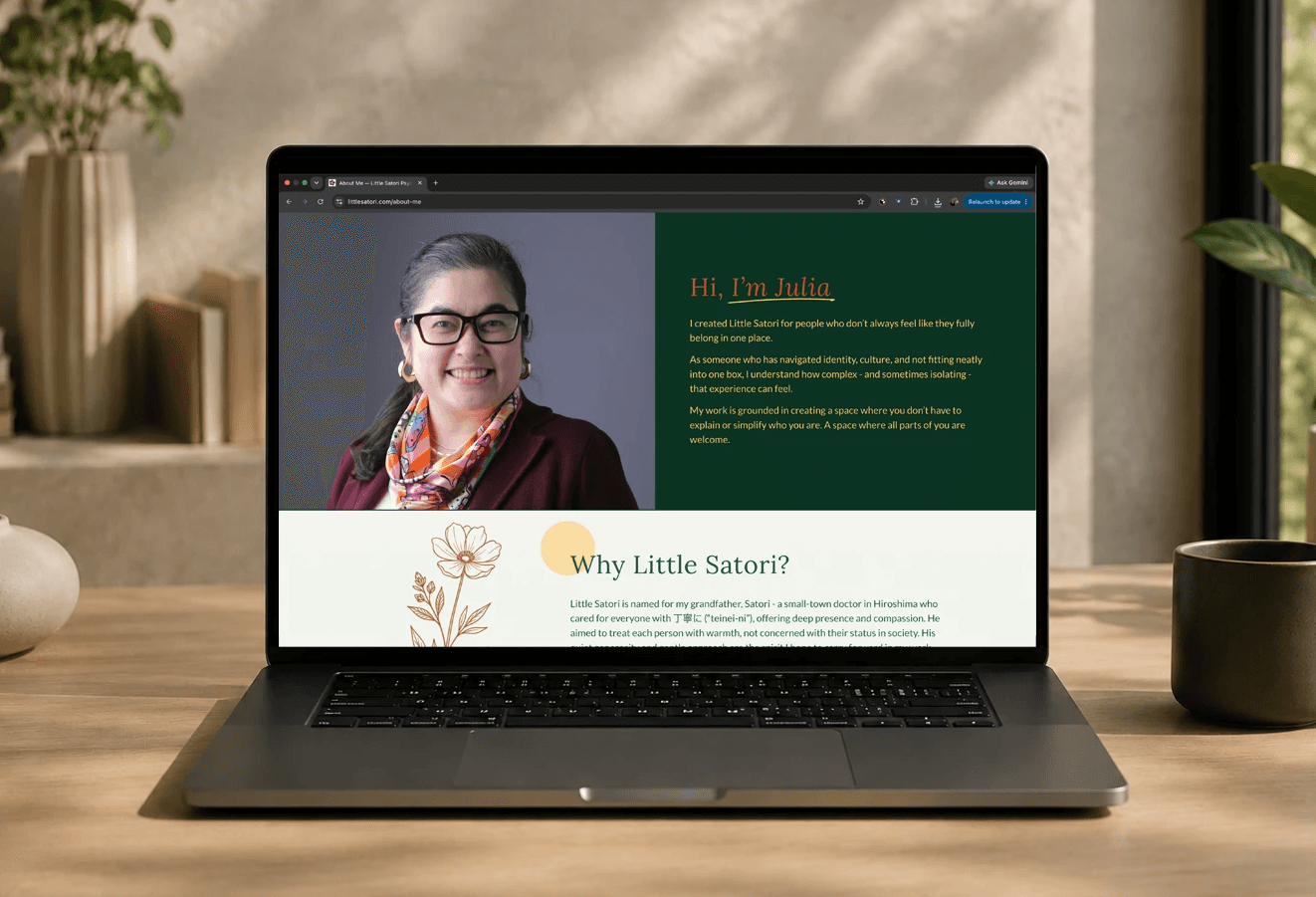


Working with Payas was a truly transformative experience as I stepped into the new chapter of
opening my private practice. Her expertise as a web designer is matched by her deep understanding
of user experience; she thoughtfully considered every perspective a potential client might have
to ensure the site was intuitive and accessible. Avoiding AI images was essential to me, and Payas
brought my vision as a therapist to life with authentic, custom illustrations that radiate genuine
warmth and humanity. Throughout the entire process, she was remarkably patient, flexible, and
attentive to every detail. Her unique blend of professionalism, creativity, and care resulted in a
website I am endlessly proud to share.
Julia Tomoyasu Silveira
Founder @ Little Satori
WORDS THAT MADE MY DAY
•ᴗ• THANKS FOR STOPPING BY
© PlanR DESIGN STUDIO 2026
•ᴗ• THANKS FOR STOPPING BY
© PlanR DESIGN STUDIO 2026


