Snippets
from the
final video
Colour
palette
Colour
palette
A soft, muted colour palette was chosen to evoke reassurance and emotional safety. Gentle neutrals
and low-contrast tones help create a non-overwhelming browsing experience, allowing visitors to
engage with the content at a comfortable pace. The colour support a calm and grounded atmosphere,
aligning with the reflective and supportive nature of therapeutic work.
A soft, muted colour palette was chosen to evoke reassurance
and emotional safety. Gentle neutralsand low-contrast tones
help create a non-overwhelming browsing experience, allowing
visitors to engage with the content at a comfortable pace.
The colour support a calm and grounded atmosphere, aligning
with the reflective and supportive nature of therapeutic work.
Snippets
from the
final video
The outcome is a welcoming and professional
online presence that reflects the therapist's values &
makes it easier for potential clients to feel informed,
supported, and confident about reaching out.
Joanna Rosenblatt
Joanna Rosenblatt
Joanna Rosenblatt
Project type
Project type
Project type
Branding, UI/UX design, development, responsive build
Branding, UI/UX design, development
Branding, UI/UX design, development, responsive build
Snippets
from the
final video
The outcome is a welcoming and professional online presence that reflects the therapist's values and makes it easier for potential
clients to feel informed, supported, and confident about reaching out.
The outcome is a welcoming and professional online presence that
reflects the therapist's values and makes it easier for potential clients
to feel informed, supported, and confident about reaching out.

© 2026 Payas bansal Design
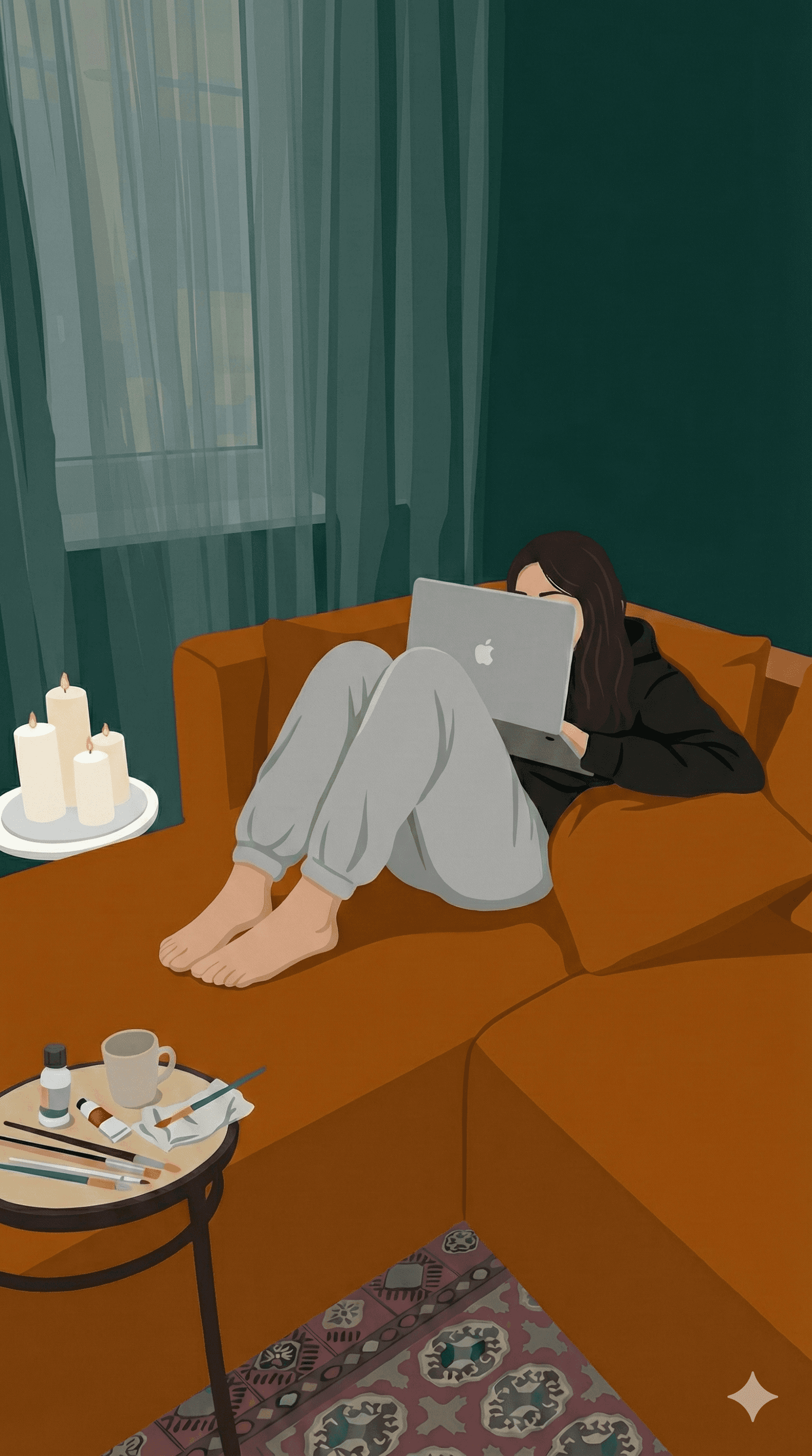
I designed and developed a website for a licensed therapist with the aim of creating
a digital space that feels calm, safe, and supportive. Because therapy is such a
personal and vulnerable experience, the website needed to communicate
professionalism and trust while also feeling warm and approachable. The overall
goal was to make information about services easy to understand and navigate,
while using design to foster a sense of emotional ease from the first interaction.
I designed and developed a website for a licensed
therapist with the aim of creating a digital space
that feels calm, safe, & supportive. Because therapy
is such a personal and vulnerable experience, the
website needed to communicate professionalism
& trust while also feeling warm and approachable.
The overall goal was to make information about
services easy to understand and navigate, while
using design to foster a sense of emotional ease
from the very first interaction.
Snippets
from the
final video
Colour
palette
Colour
palette
A soft, muted colour palette was chosen
to evoke reassurance and emotional safety.
Gentle neutrals and low-contrast tones help
create a non-overwhelming browsing ex-
perience, allowing visitors to engage with the
content at a comfortable pace. The colour
supports a calm and grounded atmosphere,
aligning with the reflective and supportive
nature of therapeutic work.


I designed a series of informational flyers to support the therapist's services in clinical and community settings. The layouts prioritise clarity, calmness, and readability, using soft colour tones, gentle hierarchy, and generous spacing to ensure the content feels supportive rather than overwhelming.
I designed a series of informational
flyers to support the therapist's
services in clinical and community
settings. The layouts prioritise clarity, calmness, and readability, using soft
colour tones, gentle hierarchy, and
generous spacing to ensure the
content feels supportive rather
than overwhelming.
The final website design focuses on clarity, warmth, and accessibility. Clean layouts and generous spacing guide the user naturally through the content,
while clear headings and structured sections make important information easy to find. The design balances professionalism with approachability,
ensuring the site feels both trustworthy and human. Responsive layouts were also considered so the experience remains smooth and readable across devices.
website mockups
website mockups
website mockups
The final website design focuses on clarity, warmth, and accessibility. Clean layouts and
generous spacing guide the user naturally through the content, while clear headings
and structured sections make important information easy to find. The design balances
professionalism with approachability, ensuring the site feels both trustworthy and human.
Responsive layouts were also considered so the experience remains smooth and
readable across devices.
The final website design focuses on clarity, warmth,
and accessibility. Clean layouts and generous spacing
guide the user naturally through the content, while
clear headings and structured sections make important
information easy to find. The design balances
professionalism with approachability, ensuring the
site feels both trustworthy and human. Responsive
layouts were also considered so the experience
remains smooth and readable across devices.
© 2026 Payas bansal Design
© 2026 Payas bansal Design
I designed and developed a website for a licensed therapist with the aim of creating a digital space that feels calm, safe,
and supportive. Because therapy is such a personal and vulnerable experience, the website needed to communicate
professionalism and trust while also feeling warm and approachable. The overall goal was to make information about services
easy to understand and navigate, while using visual design to foster a sense of emotional ease from the very first interaction.
